aesthetic fonts copy and paste
A distinctive font style can give an Instagram bio a personal feel without surrounding every word with decorative borders. With copyable aesthetic fonts, the effect comes from character substitutions: Unicode characters become the lettering you copy and paste. The result travels as plain text, although platform rendering can change its appearance.
The practical challenge is balancing visual contrast with readability. Small caps can give a short name a compact look, while flowing cursive gives a brief phrase a softer rhythm. On small screens, elaborate lettering and tightly packed decoration can create visual noise. Previewing the result, allowing empty space and checking character limits helps keep the wording readable after it reaches its destination.
What Are Aesthetic Fonts and How Does Unicode Make Them Work?
A name that keeps its unusual shape after you copy and paste it is often carrying different characters rather than an installed typeface. In this context, aesthetic fonts are decorative text assembled from Unicode variants. Unlike regular fonts, which change how existing characters are drawn, a font generator commonly substitutes similar-looking characters: A becomes 𝐀 or 𝔸. That distinction explains why the effect can travel into Instagram bios without device installation.
Unicode is the international standard that assigns code points to characters; it does not prescribe one identical visual design. A Unicode text converter uses Unicode character mappings to select replacements from Unicode blocks such as Mathematical Alphanumeric Symbols or Enclosed Alphanumerics. Those sets include mathematical bold and circled letters, respectively. Many decorative alphabets therefore repurpose characters with established meanings, rather than simply applying text formatting.
For a practical check, place styled text beside regular text and view both on another device. The operating system and its available typefaces influence rendering differences, while unsupported characters can appear as boxes. Platform support also varies, so successful copying does not guarantee correct display everywhere. Screen readers may announce specialized characters unexpectedly or skip them, making accessibility a reason to reserve decoration for short accents and keep essential information in ordinary wording.
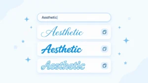
How to Use Aesthetic Font Generator
The useful test happens where your styled output lands: an Instagram caption, WhatsApp message or Discord message. After choosing a result, use its copy icon or tap to copy control to place it on the clipboard. On mobile, long-press the destination text field, then tap Paste on a computer. Check mobile readability before publishing, especially when small sizes make decorative elements harder to distinguish.
To produce that result, open aesthetic font generator in your browser and enter plain text in the text box. Compare cursive, double-struck and small caps through the text preview or instant previews when available. For example: keep a short line such as “Weekend mood” identical across options so you can compare appearance without changing the wording. When you copy and paste fonts you transfer unicode equivalents created through character replacement rather than applying a conventional font file.
Before saving a bio, check character count and platform fit extra emojis and ornaments can crowd the available space. Test the pasted result on iPhone and Android when possible since system support affects device display. If question marks or missing-character boxes appear, try simpler styles or restore the original wording. For gaming usernames, test the rename screen before name confirmation because character restrictions vary. Keep essential details in ordinary lettering: decorative unicode symbols can create reading limitations for screen readers.
Aesthetic Font Styles, Categories, Symbols and Examples
The same word can feel playful, formal or restrained before its meaning changes: bubble letters soften its outline, while bold shapes increase its visual weight. For a softer, rounder mood, try cute font styles like bubble letters, hearts and sparkles.These categories overlap rather than follow fixed aesthetic rules. Flowing script and cursive suit romantic aesthetics: angular fraktur connects with medieval styles and dark-academia. By comparison, fullwidth lettering creates the spacious vaporwave look although airy letters do not automatically make a phrase easier to scan. Double-struck letters introduce outlined strokes, while monospace gives characters a more uniform rhythm. Comparing letter variants makes these differences concrete: the letter A appears as script 𝒜, gothic 𝔄, or double-struck 𝔸. Styling also extends to numbers including circled numbers such as ①②③ and parenthesized figures such as ⑴⑵⑶.
Decoration works on a separate layer: surrounding symbols frame the wording without necessarily changing its character shapes. A moon ☾, sparkle ✧, or soft frame such as ˚₊‧꒰ა ໒꒱‧₊˚ can establish a mood around otherwise simple lettering. Decorative heart symbols, star borders and bracket styles offer different symbol shapes whereas glitch effects such as Zalgo distort the lettering itself. Combining distortion with layered ornaments can obscure the word beneath the decoration. For shorter text styles, bold lettering supplies text emphasis while small ornaments leave more visual breathing room. An aesthetic username or short bio text remains more readable when its wording is easy to distinguish from its decoration. Checking common punctuation alongside the letters also exposes mismatched styling; platform character whitelists and compatibility issues can limit which combinations survive pasting.
Where to Use Aesthetic Fonts
Aesthetic fonts can turn a QR code message into a heartfelt message with a decorative touch, extending their use beyond a public feed. On social profiles, they can distinguish a short phrase in TikTok bios, Twitter display names and social media captions. Within communities, Discord nicknames, channel names and gaming profiles offer space for expression wherever the chosen characters are supported. Everyday uses include group names, About sections and a brief greeting in facebook messenger. In note-taking apps, decoration can separate headings from highlighted information while instagram ads, facebook posts and marketing materials can use a short styled line to draw attention to an offer. A LinkedIn headline needs more restraint: limit decoration to one styled element keeping essential wording plain and easy to read.
Aesthetic Fonts for Instagram and TikTok
An Instagram bio can establish its mood through a styled name above plain lines, giving account details clean visual separation. For lifestyle creators, coquette fonts paired with delicate ornaments can complement a soft aesthetic: accounts sharing music content might use dark lettering or bold italic for a release title. Keep decoration to one or two styled elements, with one ornament per line and empty space around text. These choices shape social media first impressions without turning full paragraphs into decoration. In TikTok captions, a brief styled opening can provide emphasis, while standard lettering carries the explanation and preserves glance readability.
To prepare a matching TikTok profile, enter a short phrase into a font generator input, compare multiple styles in the text preview and use click to copy after making a style selection. Paste the result into the intended editable field then check the styled and plain text contrast on a mobile screen. The generated lettering consists of real unicode characters, making app compatibility and symbol shape relevant to its appearance. Include phone testing in profile testing, especially with fullwidth letters wide-spaced text or a sparkle trail. Keep each hashtag in ordinary lettering to avoid broken hashtags and shorten a decorated line if it crowds the surrounding details.
Aesthetic Fonts for Twitter / X
On Twitter / X, a short phrase in clean bold gives twitter posts a distinctive look while leaving the surrounding message easy to scan. For X accounts with a consistent brand, repeating one font style across social media bios and brief status updates creates a recognizable pattern: small capital, italic and cursive text offer different ways to mark a recurring label. Enter that label into a text generator, choose a preferred style and preview the converted text on mobile and desktop before publishing. Keep decorative styles in short bursts: excessive symbols and wide-spaced letters can weaken legibility especially when the wording already fills several lines.
Aesthetic Fonts for Gaming and Discord
A recognizable gaming profile starts with lettering teammates can read during a match. On discord, a display name can contain special characters while discord usernames accept only lowercase latin letters, digits, underscores and periods. A discord nickname lets you use a different name within discord servers. Pair clan tags with bold gothic lettering for a heavier look or try monospace and bubble letters as contrasting treatments for the same name. Keep aesthetic symbols sparse to avoid over-styling; unreadable fonts and stacked zalgo effects make short identifiers harder to recognize.
Enter your input text into an online tool, compare the output and use its copy icon to transfer the chosen stylized unicode text. The result consists of text characters so copying it requires no font file or font installation. Before saving a gaming username, paste the result into the gaming username field and check both text length and compatibility. For free fire, PUBG or Roblox unicode usernames as conditional on game support: name testing must happen in the intended game and field. Compare the saved result across devices for display issues and keep a version using plain English letters if decorative characters are rejected.
Aesthetic Fonts for WhatsApp and Chat Apps
In a busy group chat a decorative greeting can sit above practical notes and dates kept in ordinary lettering. Cursive unicode text adds a handwritten appearance to expressive messages while hearts, sparkles or a plain emoji can mark a celebration. For whatsApp messages such as “Happy birthday, Sara,” keeping fancy text within the greeting leaves the details easy to scan. The same approach gives a whatsApp status room for personalization: combine a short phrase with text symbols to create unique combinations without surrounding every word with decoration.
A third-party font changer offered as a browser tool converts your text input into a styled result that you can transfer to a messaging app. These copy and paste fonts use real Unicode characters, with styling built into text, rather than transferring installed font files. Before sharing stylish text messages across chats, inspect the pasted version on your phone; older devices may lack some glyphs, so consistent rendering is not guaranteed. If cursive letters appear as boxes, replace the affected characters with ordinary lettering.
Aesthetic Fonts for Ads and Promotions
An offer needs a clear reading order before it needs decorative lettering. For brand promotion, an attention anchor such as “Weekend Offer” can establish visual hierarchy without dressing up every sentence. Keep prices, deadlines and redemption instructions in ordinary lettering; reserve bold unicode text for a short promotional label. A soft launch for a skincare range could pair delicate script with restrained text styling while a streetwear release could use dramatic lettering. These choices connect aesthetic typography to the product’s character, giving social media content a recognizable structured appearance without burying the offer beneath special effects.
The useful checkpoint comes after pasting: inspect the actual placement including the smallest preview intended for mobile consumption. Compare Facebook post captions and other promotional captions against the original wording, checking that special symbols leave discount codes untouched. With a free unicode font generator, prepare two brief alternatives and change only the font selection when comparing responses. For artwork assembled in design software installed typefaces offer another route to visual formatting; copy-and-paste characters serve editable promotional text. Check consistent display wherever the promotion will appear and keep URLs in ordinary lettering so the destination remains easy to recognize.
Aesthetic Fonts for Facebook
Facebook aesthetic fonts give facebook updates a visually distinct opening through letter conversion. A font styler turns regular letters into fancy letters for facebook comments or messages without installing a different typeface. For example, unicode script characters can decorate a short greeting, while bold script text can emphasize an announcement’s opening. These unicode based styles belong to the copied characters themselves: they do not apply direct in-app font changes.
For a sale announcement, keep “50% OFF” separate from dates and conditions so the offer remains easy to scan. Use spaced text or a moon frame around a brief phrase instead of decorating every sentence. A fullwidth alphabet occupies more horizontal space while layered text adds visual density. After pasting, check the profile or post for broken characters and awkward line breaks; keep essential details in ordinary lettering when fancy fonts interrupt reading.
Threads, Reddit and More
On Threads and Reddit, a short styled opening can give comments a different look without decorating an entire discussion. Match expressive words with humor for a casual reply, or reserve playful designs for a brief celebration. In forums, keep explanations in ordinary lettering so the decoration does not compete with the answer. A useful layout is one distinctive opening followed by an undecorated question or response.
The lettering travels as characters: unicode fonts use a character system, rather than installing a typeface on someone else’s device. A text font changer can supply Latin alphabet variants, but the destination affects their native appearance. Test individual letters in a draft before publishing; treat broad compatibility as something to check across modern apps. If a decorative version becomes difficult to read, replace it with ordinary lettering instead of adding more symbols.
For Tumblr, Amino, and other online platforms, build the decoration around the purpose of the message. A diary introduction might use star symbols, while a short announcement might pair arrows with restrained punctuation marks. Keep aesthetic bios consistent with the surrounding online presentation, and leave longer daily conversations easy to scan. Reusing favorite fonts can connect your digital presence across social media platforms without giving every sentence the same treatment.
Aesthetic Fonts for Notes, Documents and School
A school handout needs clear distinctions between headings, examples, and explanations. For documents with formal needs, regular typefaces such as sans-serif or elegant serif styles can establish that structure. Keep cursive script for a short title, where its contrast with the surrounding paragraphs serves a purpose. Applying decorative lettering to the full text makes that distinction harder to maintain; assignment instructions still determine which creative uses are appropriate.
For a journal headed Dear Diary, try decorative script before decorating every section. Enter the heading into a font gen tool through its input box, browse font styles, and copy the selected version to the Clipboard. Paste it into the intended text box and check its appearance at the final print size. In school design projects, bold digits can distinguish activity labels, while regular numbers keep dates, calculations, and page references straightforward.
Before submitting an assignment, distinguish font changes made through built-in formatting from Unicode styling, which substitutes characters. Keep essential explanations in standard characters, and test search using a key phrase after exporting through PDF generators. For science notes, use superscript for exponents and subscript for chemical formulas through the editor’s formatting controls; insert the correct Math symbols for their meaning rather than choosing lookalike decorative characters.
Choosing Aesthetic Fonts, Readability and Common Mistakes
The strongest selection test is whether readers recognise the message immediately. For a professional profile or professional papers, reserve flowing script fonts and decorative symbol-heavy styles for brief accents; keep essential details in regular alphabet characters. Using a bold quote creates emphasis without turning an entire caption into distorted text. Assess letter styles at the size people will actually read, especially where mobile traffic matters, and check names alongside numeric content so similar-looking characters do not obscure dates or prices.
Overcrowding often causes more difficulty than the chosen typeface. Combining star frames, Unicode diacritics, and glitch effects can make a short line harder to scan; limit decoration to one frame per line, then remove anything that competes with meaning. In multi-line bios, full-width characters and spaced-out lettering can force awkward wrapping because character width affects how much fits across the display. Keep a standalone username recognisable: additional symbols can introduce username clutter without making the name easier to remember.
Visual similarity also hides compatibility problems: plain Unicode text does not guarantee consistent appearance. The System font influences rendering, while browsers and email clients may display identical characters differently; old devices or outdated operating systems can show placeholders. Run styled-name testing before saving, since blocked character sets may prevent acceptance. Where available, use built-in options for bold text or cursive styling, and check screen-reader output before relying on decorative characters for essential information.
Custom Favorites List
Build a custom favorites list around repeat uses: subtle cursive for a quote, clean double-struck for a stylish bio and dark gothic for gaming tags. Keep the original wording beside its stylized variants so future customization starts from readable text. Label saved examples by destination such as folder names, status messages or linkedIn headlines and check how they display in the intended apps before keeping them. Grouping aesthetic text styles this way gives each favorite a specific role and makes the next copy-and-paste choice easier to find.
Over 250 Styling Options
With over 250 styling options, the same phrase can shift from dreamy cursive to mathematical bold without changing its wording. The style variety extends beyond letter shapes: flower frames, galaxy borders and hearts-between text add decoration, while mirror text and alternating case change how a line is read. For a softer finish, pair airy letters with soft ornaments; for sharper contrast, explore blackletter typefaces, boxed characters or bold-edge framing. Comparing these fancy text styles on a short sample reveals which combinations suit an aesthetic bio, creative posts or game profiles before you copy and paste.
Easy, Fast and 100% Free
Refreshing a social profile can take less than a minute with a 100% free tool. This free font generator turns typing into instant styles through real-time generation letting you copy a result with one click. Open it in a desktop browser or on mobile devices: there are no downloads, no installation and no signup. You need no design skill and no software to create aesthetic letters at no cost, whether you want a short bio or a heading.